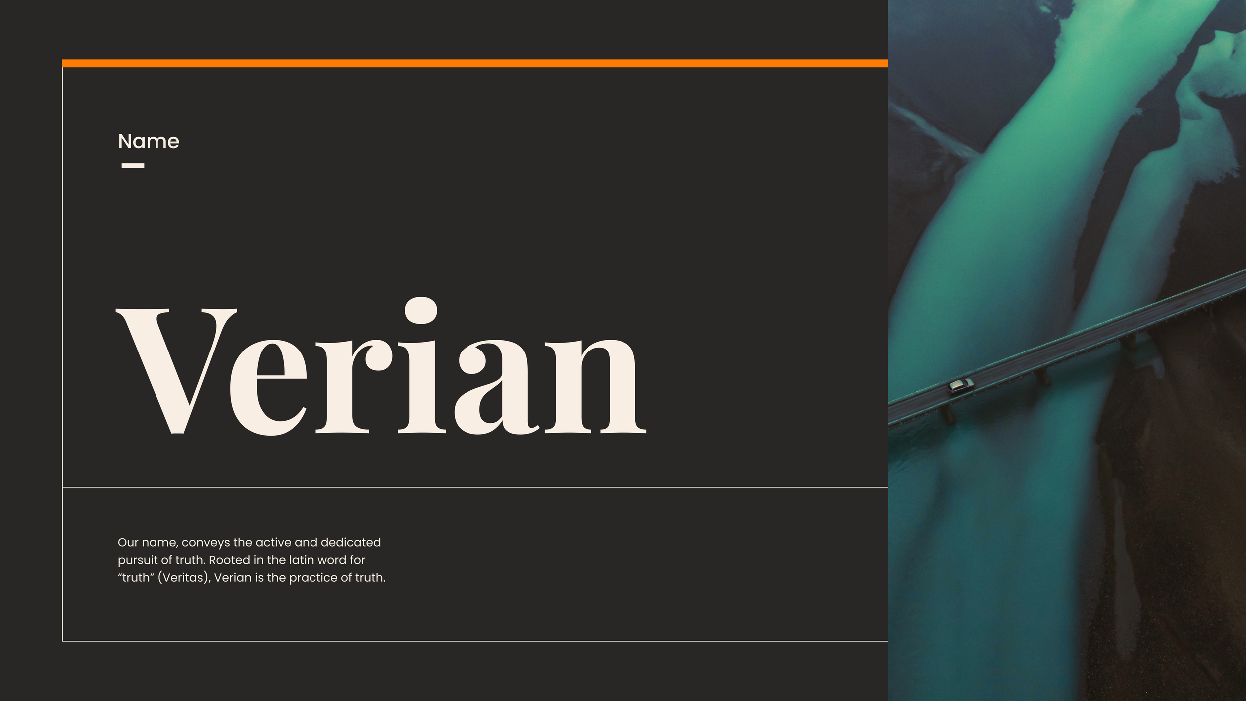


Verian:
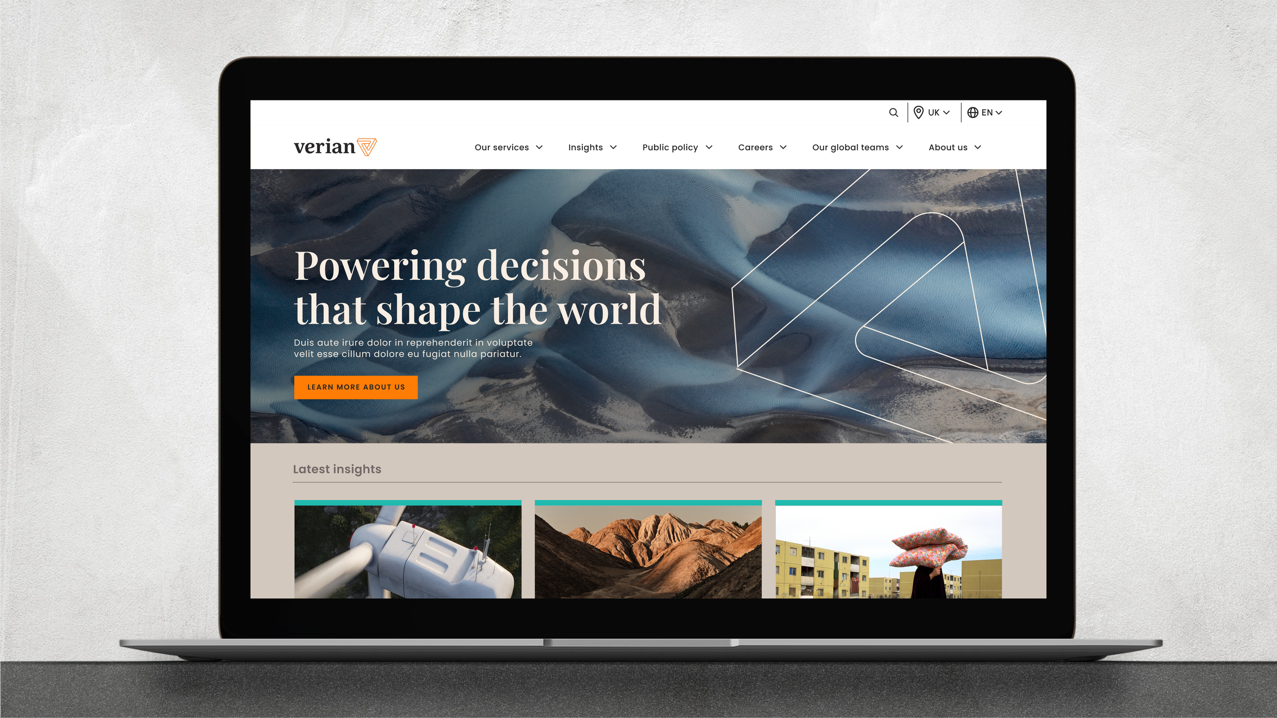
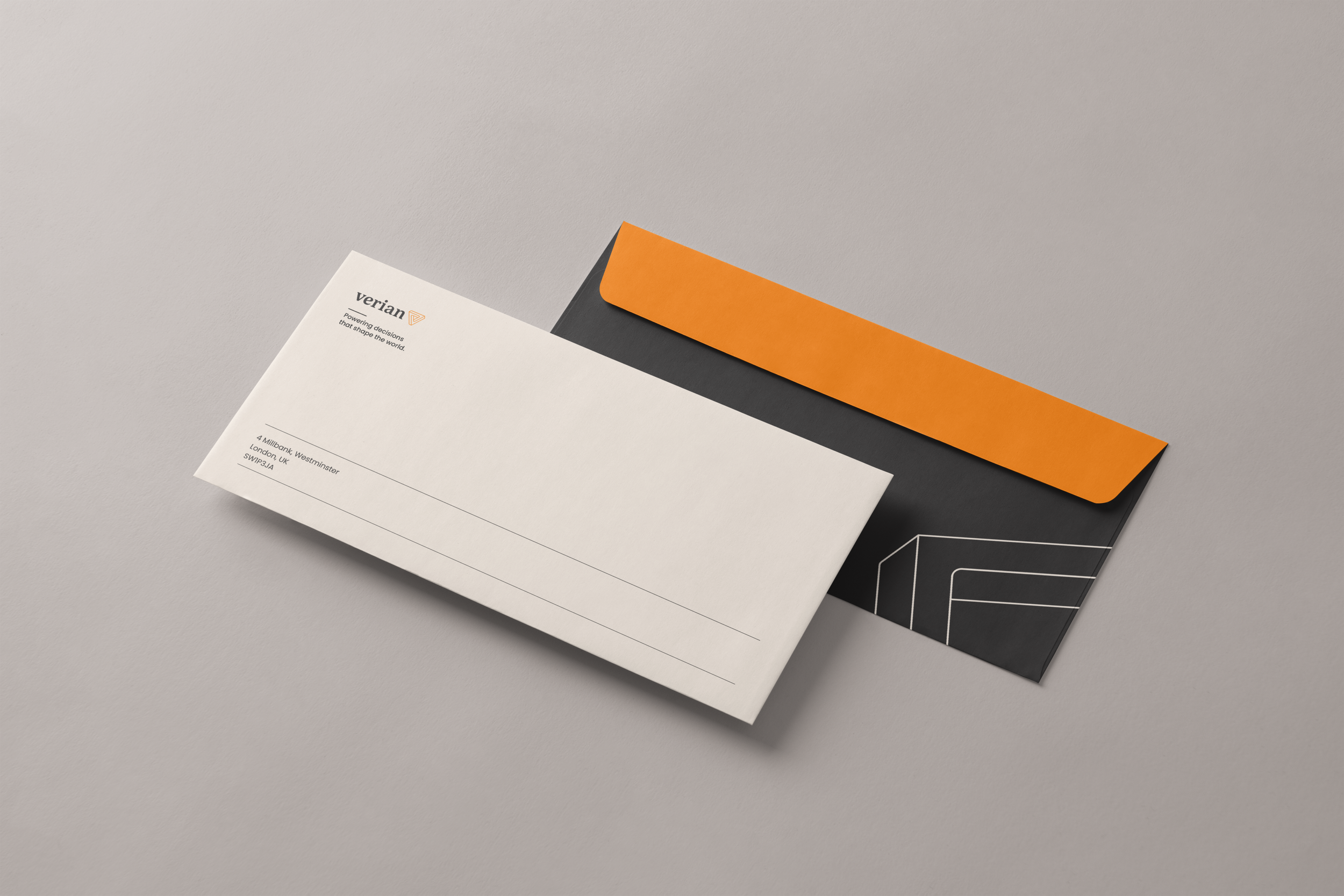
Powering decisions
that shape the world.
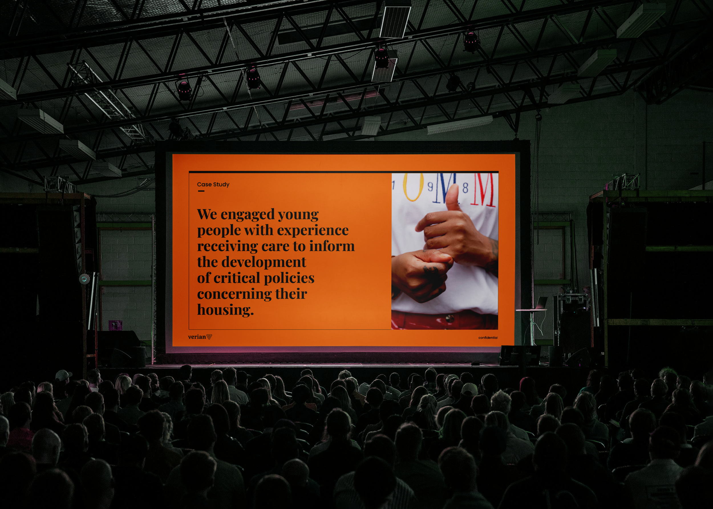
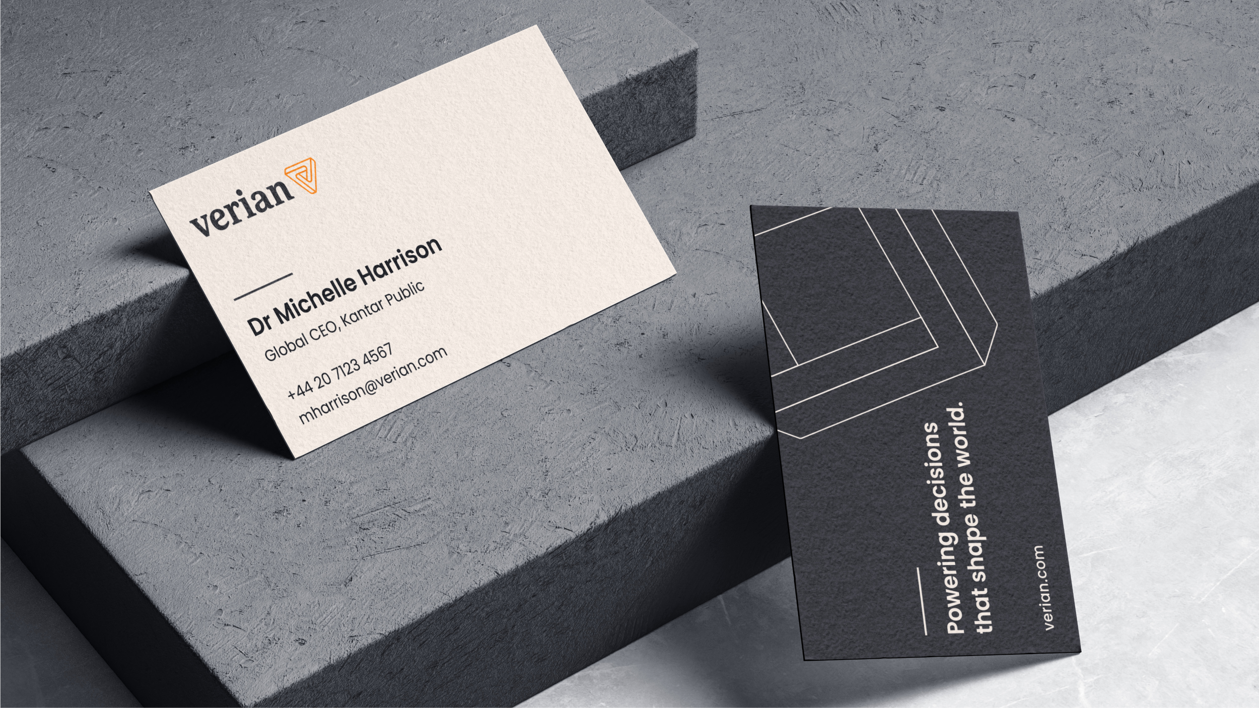
The “v” shape reinforces the name and serves as a dynamic, iconic emblem that positions Verian as industry pioneers. Their primary color palette leans into the brand’s declarative future, elevating whites and gray scales with purposeful pops of orange and teal. Graphic expressions reflect the brand’s relentless pursuit of progress—through key hero shapes and dynamic content structures, in addition to purpose-driven photography that reflects the intersectionality of the communities around the world Verian influences.
Project created @monigle.
Logo, visual identity and web design.